

-
insulin evrane injection
Concept injectable insulin therapy -
lipravastatin tablets
Concept lipid-lowering therapy -
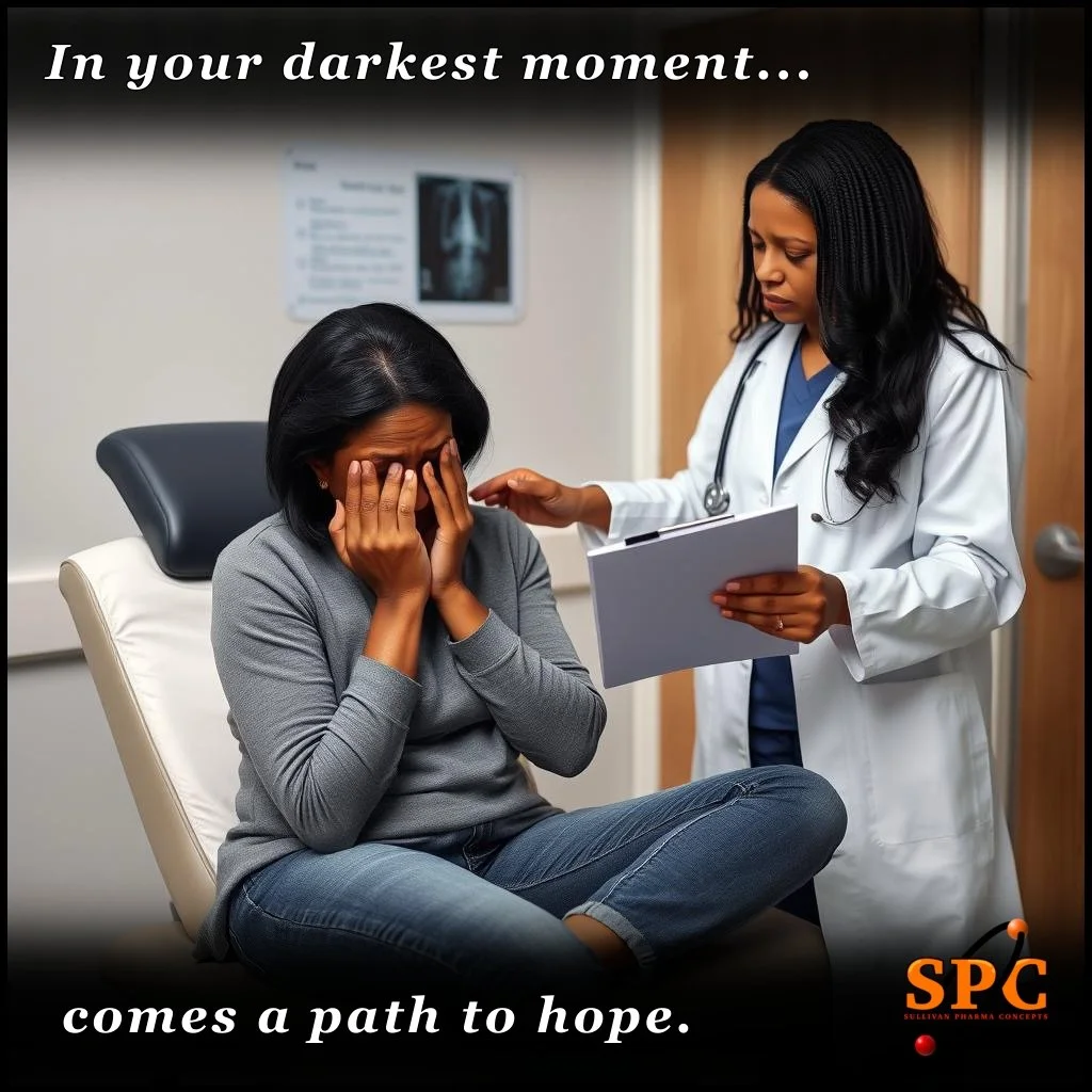
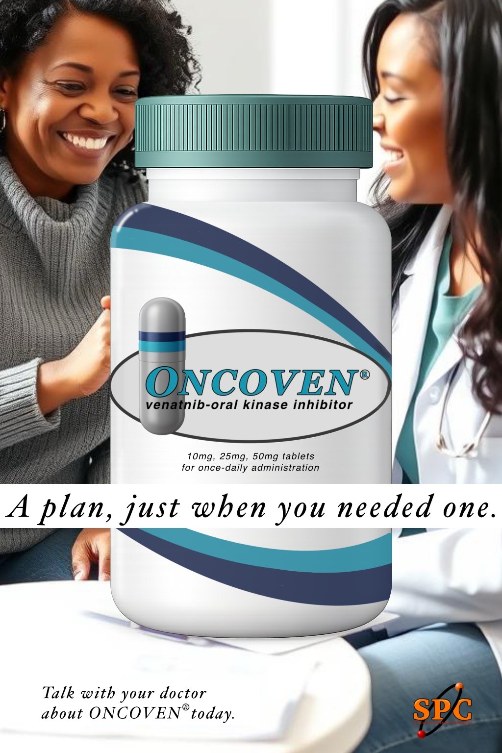
venatnib tablets
Concept oral oncology therapy -
Partially Hydrolyzed Gentle Baby Formula
This page is optimized for desktop viewing. All brand names and visual materials shown are fictitious and created for conceptual portfolio purposes only.

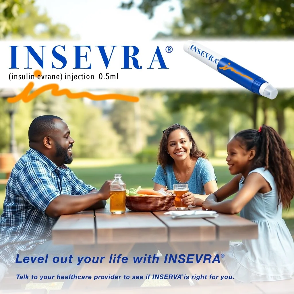
Insulin (injectable biologic)
Name: INSEVRA (CONCEPT)
Name Dissection:
Clear insulin association
“Ins-” is common and expected (Humulin, Novolin, Insulet)
Neutral pharmacologic tone
“-evra” suggests duration/flow without promising long-acting, fast-acting, or stability
Avoids safety or efficacy claims
No “steady,” “control,” “rapid,” “basal,” “gluco”
Distinct from existing insulins
Not confusable with Lantus, Levemir, Tresiba, Novolog, Humalog
Clean verbal profile
in-SEV-ruh
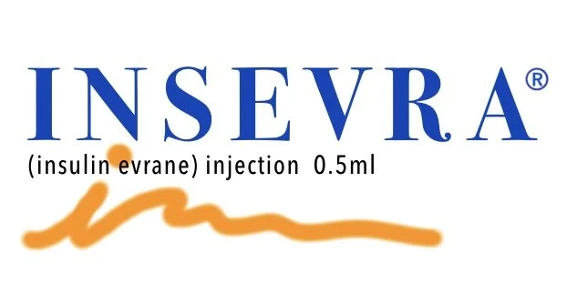
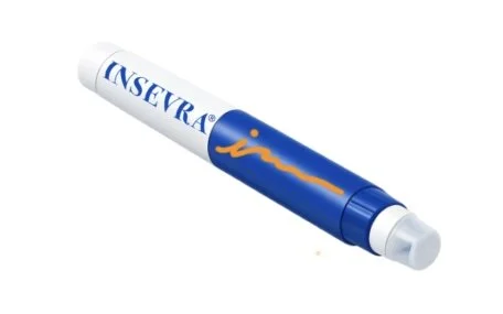
Color Scheme: Royal Navy/Mustard/Linen


Statin (oral, chronic use)
Name: LIPRAVA (CONCEPT)
Name Dissection:
Implicit lipid association without overclaiming
“Lip-” → lipids (common, but acceptable)
“-rava” → neutral, soft ending (not efficacy-claiming)
Low risk of false superiority
Doesn’t imply “strong,” “max,” “safe,” or “cure”
Low LASA (look-alike / sound-alike) risk
Distinct from Lipitor, Lescol, Pravachol, Crestor
Pronunciation clarity
lip-RAH-vuh
No embedded claims
Avoids “chol,” “stat,” “cardio,” “protect”
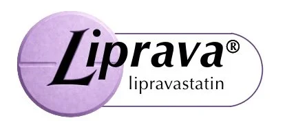
Color Scheme: Violet/Midnight/Linen
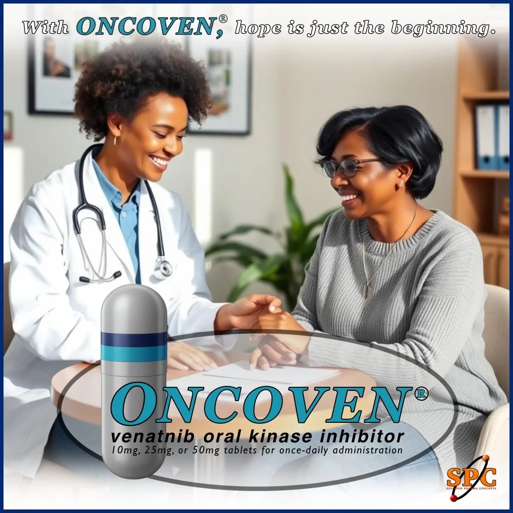
ONCOVEN® (new mock concept)
Generic: venatnib
Drug type: Oral oncology therapy (kinase inhibitor)
Name Dissection:
Oncology drugs are sensitive in nature
“-nib” is the correct INN stem for kinase inhibitors
The root “vena–” feels biological without implying:
cure
targeting
specificity
Proprietary name is sober, serious, and conservative
Color Scheme: Slate-Navy Blue/Darkened Teal/ Nimbus Gray
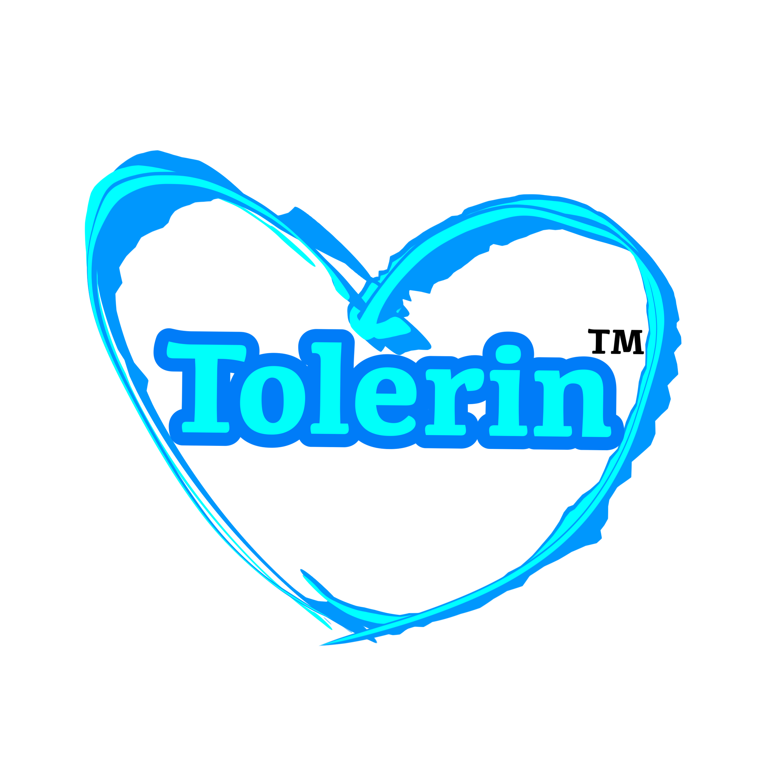
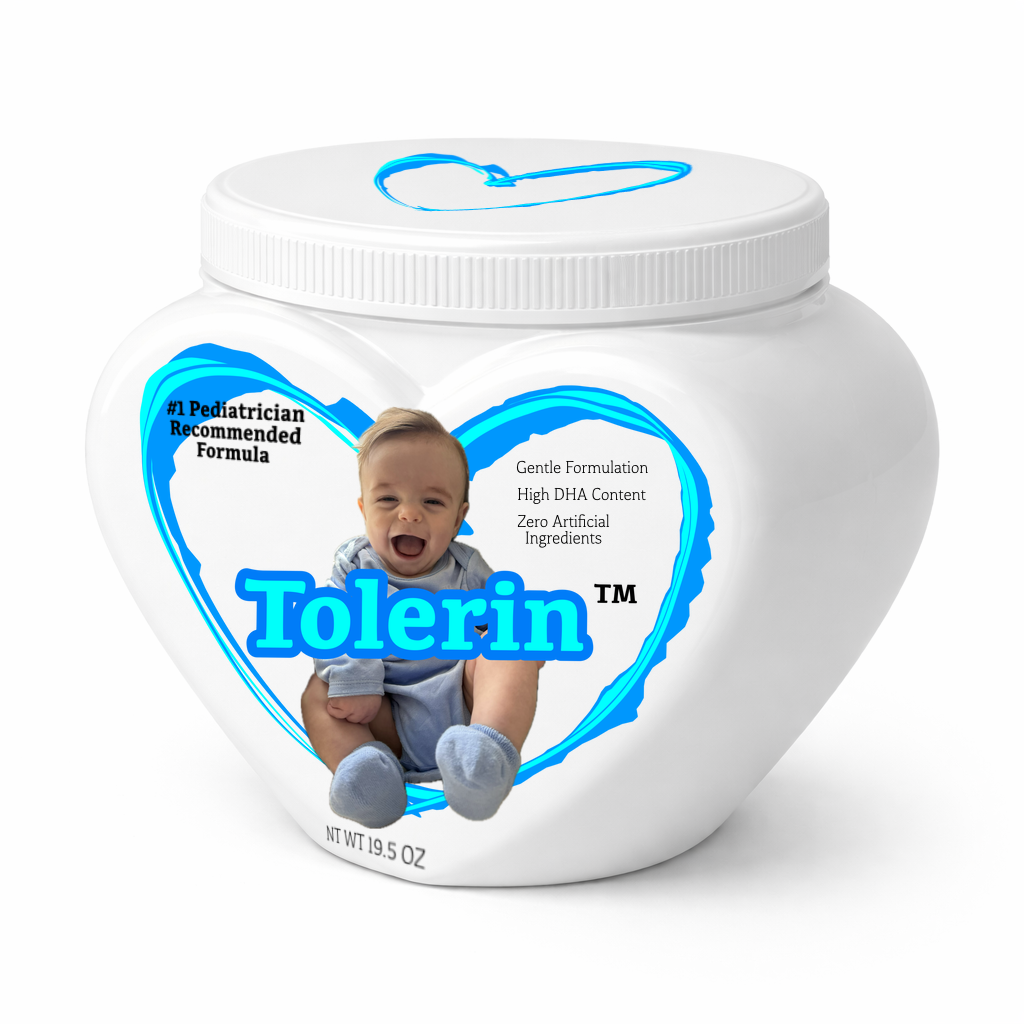
TOLERIN® Gentle Baby Formula
Generic: Partially Hydrolyzed Milk-Based Amino Acid Powder
Drug type: Baby Formula - Gentle Digestion
Name Dissection:
Meaning/Claims: LOW–MODERATE
Implies improved tolerance/digestibility
Acceptable if not paired with explicit claims like “prevents colic”
Distinctiveness: HIGH
Presents a legitimate, ownable pharmacological name
Designed to offer a trustworthy, simple, and time-tested product
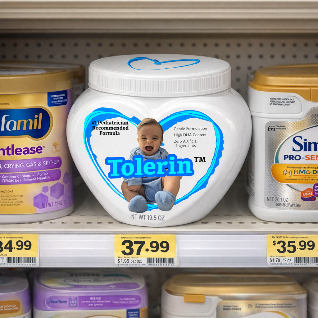
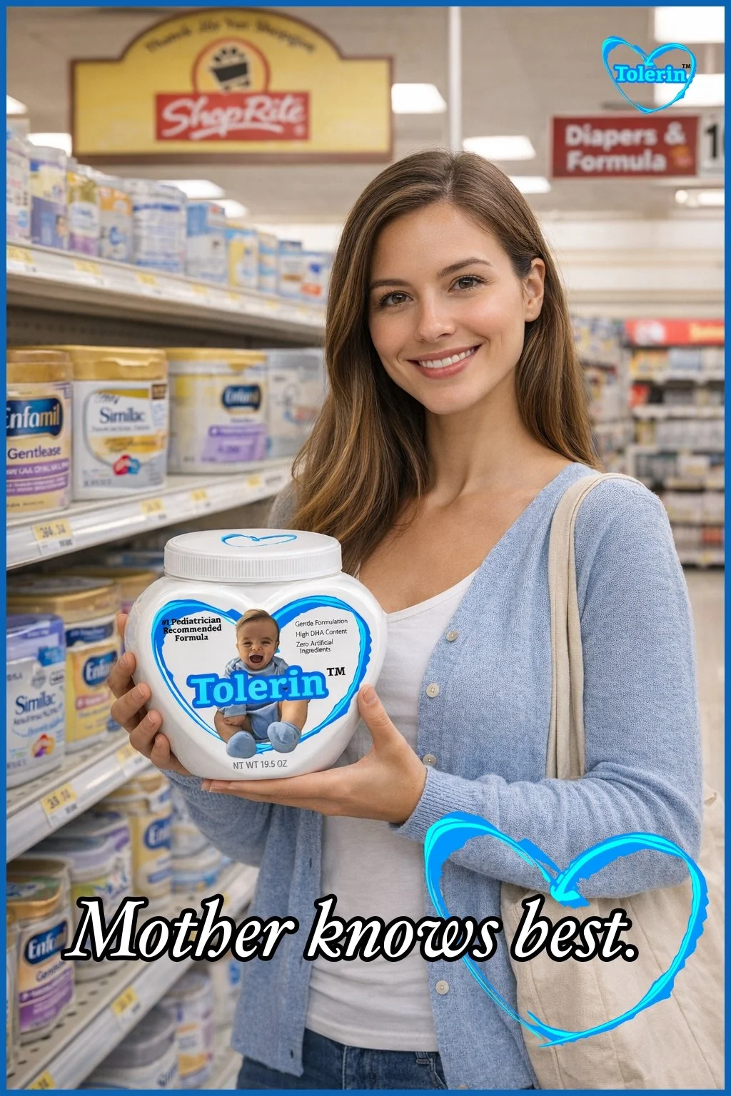
Love, your baby can stomach.
About the designer
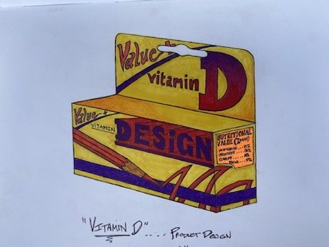
The hand-drawn image shown here is intentional. It reflects an early interest in brand identity, symbolism, and visual meaning that predates the availability of AI-driven tools. Long before automated systems entered the creative process, I was thinking about how form, color, and composition communicate strength, trust, and purpose. That curiosity — about how visual language influences perception — continues to guide my work today, now informed by a search for knowledge and hence, a deeper understanding of regulated environments.
s.p.c. on pharmaceutical design
I started designing logos/ product imagery/ even working on proprietary names because these things called to me. I used to see drug commercials and wonder whose job it was to throw the scrabble pieces down to come up with the next big name. Clearly there’s much more to the process.
As I learned more about the reality of pharmaceutical branding, I came to appreciate that naming and visual identity in this space sit at the intersection of creativity and regulation. Processes involving FDA oversight—OPDP review, DMEPA safety analysis, and INN conventions—add layers of rigor that make this work far more deliberate than it appears on the surface. What initially looked like intuition and wordplay is, in practice, a careful balance of linguistics, human factors, visual perception, and risk reduction.
My academic background in graphic design and psychology naturally aligns with this environment. I’m drawn to visual systems that must communicate clearly under constraint, and to design decisions that account for how real people read, interpret, and sometimes misinterpret information. I enjoy working within rules when those rules exist to protect patients and improve outcomes. While this work is demanding and highly specialized, it’s also where my interests and training converge. I believe I would be a strong fit within an organization focused on pharmaceutical branding and naming, or in a direct collaborative role where disciplined creative thinking, visual clarity, and regulatory awareness are essential.
I am available for collaborative or contract work. For professional inquiries, please connect via LinkedIn.
-Kevin Sullivan / Sullivan Pharmaceutical Concepts